 This is another Different Stokes for Different Folks challenge. Karin asked everyone who wanted to participate to send a photo of themselves which she then distributed to the group at random. No one knows who anyone is and the point is not to do a portrait but a good painting from the reference photo. Of course, wanting to capture a likeness is almost irresistible, but no one will know except the person who sent in the photo of themselves. The painting to the left is of me, done by John Wolff, who does not have a web site, so I cannot direct you to more of his work. This is a nice watercolor and it certainly looks like me. It inspired me to try a watercolor of the photo I received.
Here is how I went about the painting:
Session one:
Here's the dude I got.
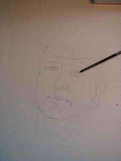
The first thing I did was convert the photo to black and white so I could see the values better with out the distraction of the color. Then I made a grid on the photo and a grid on my paper and started drawing. I did this because I know that a likeness does not come from details but from the proportions of the face so I wanted to get that right. I also consistently have trouble getting eyes to line up properly, so I added and extra diagonal line for reference.
 After I got the sketch done I added a few dots of latex resist to the right eye the tip of the nose and the stubble on his chin - all whites that I did not want to lose and were too small to avoid.
The guy removed all the background from his head-shot so I have no idea whether he is a real cowboy or not. I think not. I think he was trying to make things more interesting, which is the same reason I wore a red hat.
I'm thinking the black hat is way too bold and will overpower his face so I do some value sketches to see how I might switch things around for a better composition. I like the last one best, thinking I'll suggest some western landscape in the background.
Speaking of color- the color of these photos varies wildly because the natural light in my studio was fading and I was using a study lamp for light.
I'm making the format bigger than I think I want it in the end. One of the nice things about working on paper is the option to crop the painting later.
Here are the first color washes and a B&W to check on the values. I find my digital camera very handy for this and can see things in that small format that I don't see when I'm looking at the painting. It's another way of "squinting", I guess.


Session two:
 I allowed the painting to dry overnight before attempting the eyes. I didn't want the color to bleed and besides I wanted to be fresh when I painted this important element. I'm glad the latex is there to keep that highlight!
Time to check the reference and the plan. The left half of the face is still too light and the nose looks like it's sliding off to the right.

This is better but he's beginning to look a lot like GWB!! Is it the white hat or have I just seen that face TOO many times?
Here's where I decided to stop. I cropped it so his bright eye is about one-third down from the top and one-third over from the right, a prime focal point. Don't know about the red dots on his hat...hmmm.


Another adventure in watercolors! It sort of looks like him, but I won't be hanging out a shingle advertising portrait painting quite yet!


